Discover the emotional power of red, blue, and yellow in home design. Learn how to use these colours to style with confidence and personality—without overwhelming your space.
Table of Contents
- Why Primary Colours Matter in Interior Design
- Red: The Colour of Energy & Warmth
- Blue: The Colour of Calm & Clarity
- Yellow: The Colour of Optimism & Light
- How to Use Primary Colours Without Overwhelm
- Balanced Primary Colour Palettes
- Designer Tips for Everyday Spaces
- Final Thoughts
Why Primary Colours Matter in Interior Design

Primary colours—red, blue, and yellow—are more than just the foundation of the colour wheel. In interior design, they act as emotional anchors and bring depth, contrast, and personality to a space. When used intentionally, these colours can:
- Energize a dull room
- Establish visual harmony
- Reflect the homeowner’s character
- Create focal points and drama
Many people shy away from primary colours out of fear of overdoing it. But when paired with the right tones and placement, they can uplift your space without feeling too strong or "childish."
🔴 Red: The Colour of Energy & Warmth
Red evokes power, emotion, appetite, and heat. It’s the colour of action, passion, and even confidence. In the home, red draws attention—so it should be used with precision. Red is the colour of fire, blood, action, and strength. It stimulates the senses and can raise energy levels, heart rate, and even appetite.

Red in Different Design Styles
✔️ Modern:
Use red with black, white, or metallics like chrome or gold for a bold, sleek look.

✔️ Boho or Eclectic:

✔️ Minimalist:
Choose a muted red (like clay or brick) and limit to one focal point — such as a lamp or vase.

✔️ Traditional:
Burgundy, maroon, or crimson blend well with dark woods and classic furnishings.

Designer Insight on Red
“Red should be used like a signature — bold, confident, but not everywhere. One red focal point can completely shift the mood of a room without overwhelming it.”Best Places to Use Red:
Dining Room: Sparks appetite and lively conversations. Red stimulates appetite and conversation. Deep reds like burgundy or wine are especially elegant in dining spaces.✅ Use red in:
- Upholstered dining chairs
- A painted feature wall
- Table runners or statement art

✅ Add red through:
- Bar stools
- Cabinet knobs or handles
- Small appliances (toaster, kettle, mixer)
✅ Try:
- A red armchair
- Throw pillows on a neutral sofa
- A Persian-style rug with red patterns
✅ Try:
- A red console table
- Abstract red artwork
- A patterned runner rug
Pairing Tips:
Balance red with neutral backdrops like beige, white, or light wood. Pair with black or brass for a rich, modern edge. Ways to keep red from overwhelming a space;
Use the 60-30-10 rule: Let red be the 10% accent.
Pair red with neutrals (white, beige, taupe) to tone it down.
Mix red with natural textures (wood, rattan, jute) to soften its intensity.
Add lighting to keep red areas from feeling heavy or dark.
Design Examples:
- A white dining room with red velvet chairs and a gold chandelier.
- A modern kitchen with matte red cabinets and concrete countertops.
- Boho interiors with tribal red rugs layered on wood floors.
Emotional Impact:
- Creates warmth and intimacy
- Increases adrenaline and alertness
- Can cause tension if overused or too intense

Shades of Red to Consider
| Shade | Best For | Mood Created |
|---|---|---|
| Brick Red. |
Accent walls, rustic spaces | Earthy, grounded |
| Crimson |
Dining, formal rooms | Bold, rich, romantic |
| Cherry Red |
Kitchens, art pieces | Fun, energetic |
| Wine/Burgundy |
Traditional interiors | Sophisticated, warm |
| Rose/Muted Red |
Bedrooms, soft spaces | Feminine, gentle warmth |
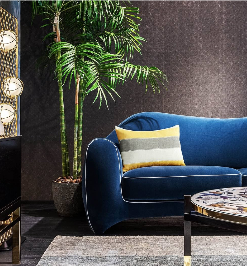
🔵 Blue: The Colour of Calm & Clarity
Blue is widely loved in interiors for its cool, calming, and clarifying properties. It symbolizes peace, honesty, and trust, making it ideal for restful spaces.
Best Places to Use Blue:
1. Bedroom: Rest & Recovery
Blue is scientifically proven to lower heart rate and reduce stress—perfect for sleep.
✅ Try:
- Soft blue walls
- Navy or indigo bedding
- Pale blue curtains or artwork

2. Bathroom: Spa Reset
Blues make bathrooms feel like a luxurious, tranquil retreat.
✅ Try:
- Sky blue or aqua tiles
- Navy bath mats and towels
- Pale blue cabinets or sinks

3. Living Room: Lightness or Drama
Depending on the tone, blue can feel either airy or sophisticated in shared spaces.
✅ Options:
- Pale blue with neutrals for a coastal vibe
- Navy with gold accents for drama
- Blue velvet furniture for luxury

4. Home Office: Focus & Clarity
Blue increases mental clarity and productivity—ideal for work zones.
✅ Use:
- Slate or steel blue walls
- Blue desk accessories or organizers
- Navy feature wall for contrast
Pairing Tips:
Mix deep blue with metallics like gold or brass. For a minimalist look, combine soft blue with greys, whites, and light natural woods.
With White or Cream: Clean, crisp, nautical or classic.
With Beige, Wood, or Sand: Warm + cool balance, ideal for earthy or coastal styles.
With Gold or Brass: Glamorous and rich, especially with navy.
With Green: For a nature-inspired palette.
With Black or Charcoal: Ultra-modern and masculine.
Designers Tip:
“Blue invites calm into a space. It can be soft and dreamy or bold and confident. I always recommend layering textures with blue—velvets, linens, ceramics—to keep the look dimensional and livable.”-Gloria Iloanya
Design Examples:
- Navy feature wall behind a white bed frame.
- Powder blue tiles in a bathroom with gold fixtures.
- Sky blue cabinets in a Scandinavian-style kitchen.
Emotional Impact:
- Encourages relaxation and reflection
- Promotes mental focus and stability
- Excessive cool tones can feel isolating or cold if not balanced

🛒 Amazon pick
Shades of Blue to Explore
| Shade | Best For | Mood Created |
|---|---|---|
| Sky Blue. |
Bathrooms, kids’ rooms | Fresh, calming, innocent |
| Navy Blue |
Living rooms, offices | Bold, grounded, classic |
| Powder Blue |
Bedrooms, vintage styles | Soft, airy, romantic |
| Steel Blue |
Offices, modern spaces | Cool, focused, serene |
| Teal/Aqua |
Kitchens, bathrooms | Energetic, fresh |

🟡 Yellow: The Colour of Optimism & Light
Yellow is the colour of sunshine, happiness, and optimism. In colour psychology, it evokes joy, energy, and mental clarity. It’s especially powerful in spaces that need brightness, cheer, and a sense of openness.
But yellow can be tricky — too much of the wrong tone can feel artificial or overstimulating. The key is using it with balance, purpose, and harmony.
Yellow is the ultimate mood lifter. It represents sunshine, creativity, and warmth. But it must be used wisely—too much yellow can feel overwhelming or artificial.
The best ways to incorporate yellows are through accessories such as;
Accent pillows and throws
Art prints with yellow tones
Table runners or ceramic dishes
Lampshades or pendant lights
Area rugs with yellow patterns
Floral arrangements (sunflowers, billy buttons, yellow roses)
You want it bold and daring then go for a unique furniture with a bright yellow.


Best Places to Use Yellow:
1. Kitchens & Breakfast Nooks
Yellow stimulates appetite and feels sunny in the morning light. It’s a popular colour for energizing kitchen walls, stools, or tile backsplashes. Especially breakfast nooks or small spaces with little light.
✅ Try:
- Mustard or golden yellow bar stools
- Warm yellow backsplash
- Vintage yellow kettles, mugs, or accessories

2. Living Rooms
Use yellow as an accent to lift mood and break neutral monotony.
✅ Try:
- A yellow armchair or pouf
- Patterned throw pillows or rug accents
- Framed yellow abstract art

3. Children’s Rooms or Play Areas
Yellow supports learning, creativity, and joyful play when used in soft or pastel shades. It brings fun, learning, and light.
✅ Try:
- Pale yellow walls or ceiling
- Storage bins or book shelves in sunshine yellow
- Art decals or bedding with yellow details

4. Entryways or Hallways
Create a welcoming and bright first impression with yellow — especially in spaces that lack natural light. Gives a cheerful first impression.
✅ Try:
- Golden framed mirror
- Lemon yellow console table
- Ochre wall sconce or pendant light
Pairing Tips:
Go for mustard, ochre, or pale yellow tones to avoid intensity. Yellow pairs well with navy, grey, blush, and even olive green.
60-30-10 Rule: Use yellow for 10% of the room (pillows, art, a chair).
Pair it with calm colours: Like white, grey, taupe, navy, or sage.
Choose muted tones: If you want warmth without brightness, use ochre or mustard instead of pure yellow.
Use texture: Yellow velvet, linen, or ceramic adds depth and sophistication.
Designers Tip
- Mustard throw pillows on a grey sectional.
- Lemon-yellow artwork in a neutral hallway.
- Yellow vintage chairs around a walnut dining table.
Emotional Impact:
- Boosts mood and creativity
- Encourages positivity and openness
- In excess, it may cause restlessness or anxiety
| Shade | Best For | Mood Created |
|---|---|---|
| Pale Yellow |
Nurseries, small rooms | Soft, airy, innocent |
| Lemon Yellow |
Kitchens, hallways | Fresh, cheerful, bright |
| Mustard Yellow |
Living rooms, vintage styles | Warm, retro, grounded |
| Golden Yellow |
Dining rooms, accents | Elegant, uplifting |
| Ochre |
Boho or rustic spaces | Earthy, rich, cozy |
How to Use Primary Colours Without Overwhelm
It’s not about painting every wall red, blue, or yellow. Instead, use these colours to guide mood and draw the eye. Here’s how:
- Choose one dominant primary colour per space.
- Use the 60-30-10 rule (60% neutral, 30% secondary, 10% primary accent).
- Rely on accessories to test colour before committing (pillows, vases, rugs).
Examples:
- Living Room: Beige walls (60%), navy sofa (30%), red cushion (10%)
- Kitchen: White cabinetry (60%), pale yellow backsplash (30%), blue stool (10%)
Balanced Primary Colour Palettes
Here are a few curated palette ideas using red, blue, and yellow in modern, subtle ways:
Palette 1: Warm & Organic
- Muted red (terracotta)
- Dusty blue
- Mustard yellow
- Beige and cream for balance
Palette 2: Coastal Calm
- Sky blue
- Off-white or driftwood beige
- Lemon yellow accents
- Natural textures like rattan or jute
Palette 3: Bold Urban Chic
- Navy walls
- Gold hardware
- Cherry red furniture or accessories
Designer Tips for Everyday Spaces
- Use natural light: Primary colours pop best in bright rooms.
- Start with a neutral base: Then layer in primary tones slowly.
- Let texture soften bold tones: Like linen, rattan, matte paint, or brushed metal.
- Use art as a tester: Before painting, hang bold artwork to feel the energy.
Final Thoughts
When used thoughtfully, primary colours can:
Transform the emotional tone of a room
Support specific functions (e.g., focus, rest, sociability)
Express personal identity through bold or subtle touches
But balance is key. Overuse can create tension, while strategic use can bring harmony.
🎯 Final Tip: Let Emotion Guide Design
Instead of asking “What colour looks good?”, ask:
How do I want this room to feel?
What energy do I want to invite?
Then choose the primary colour that matches that emotional goal.
Primary colours are timeless. From bold statement walls to subtle decor choices, they offer endless design flexibility — when used with care.
Start small, experiment with balance, and let the emotion of colour guide how your home feels.
Comments
Post a Comment